🏡
vizdxp - an open source data visualization and EDA webapp
vizdxp is an open-source web application designed via streamlit and weaved with plotly library. Its incredibly simple to use - Just drag & drop any csv and explore the data visually. By default the application will figure out better visualization based on user selections. Feel free to customize as needed.
Key Features
- Simple and quick for any Exploratory Data Analysis
- Create interactive Dashboard web app within minutes from any csv and share the findings
- Deploy it as a web application in your own workstations too
- By Default - chart types and aggregations are applied based on columns selected by user, null rows are removed, date fields are converted to multiple subfields
- Highly Customizable
- Easily Extensible for additional chart types
- No more static reports. Host this webapp in your organization, intended users can explore their view instead of just viewing processed static reports
- Chart types included - Scatter, Bar, Pie, Heatmap, Histogram and Box plots
Installation
(In a terminal/command prompt)
pip install vizdxp
(After Installation is complete)
python -m vizdxp
Explore vizdxp through a browser. Once installation is complete, user can work totally offline.
This package is also hosted online. Pls feel free to explore with your own data
Steps to explore
- upload your data in .csv format in the left pane (max limit 200mb)
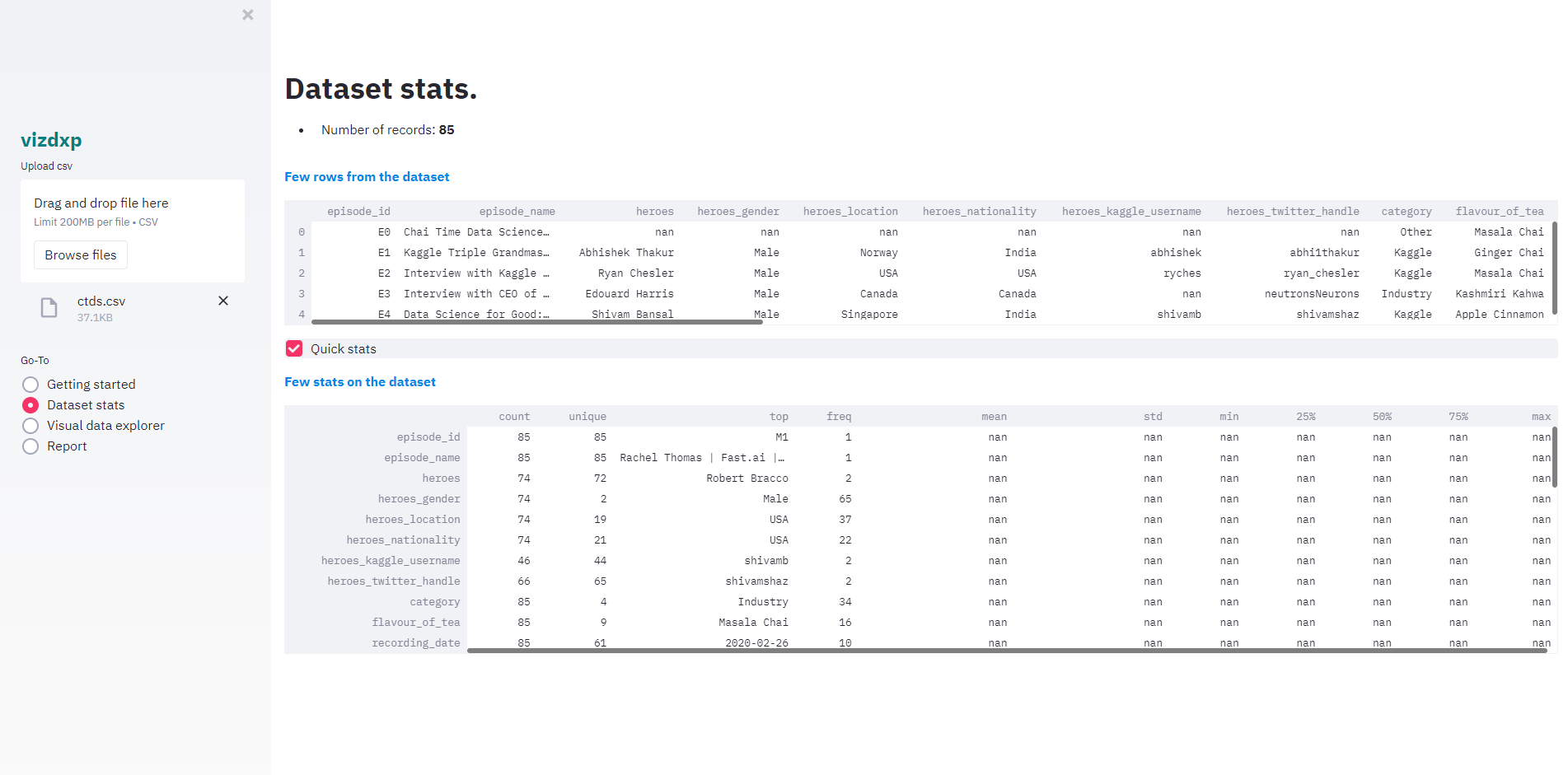
- Once the data is uploaded, user can get quick view about the dataset in “Dataset stats” by clicking the radio button in the left pane
- Glimpse few rows from the dataset to get a sense of the dataset
- Total records
- By column: count, unique value count(unique), top unique valued record (top) and its frequency(freq), mean, standard deviation(std), min value(min), max value(max), percentiles 25%, 50% and 75%
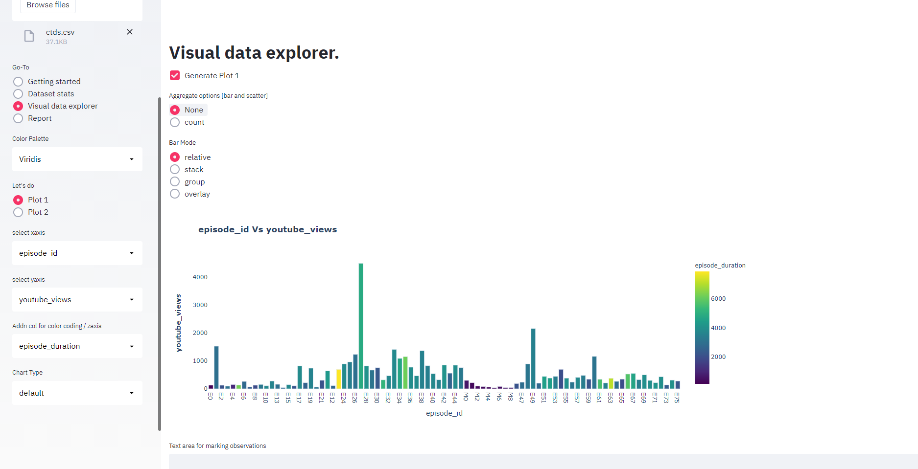
- select “Visual Data Explorer” in the left pane
- select xaxis, yaxis and click “Generate Plot 1 in right pane” to get default graph. Based on chosen columns, default graph type and options will be generated. User can change graph type and options based on the need.
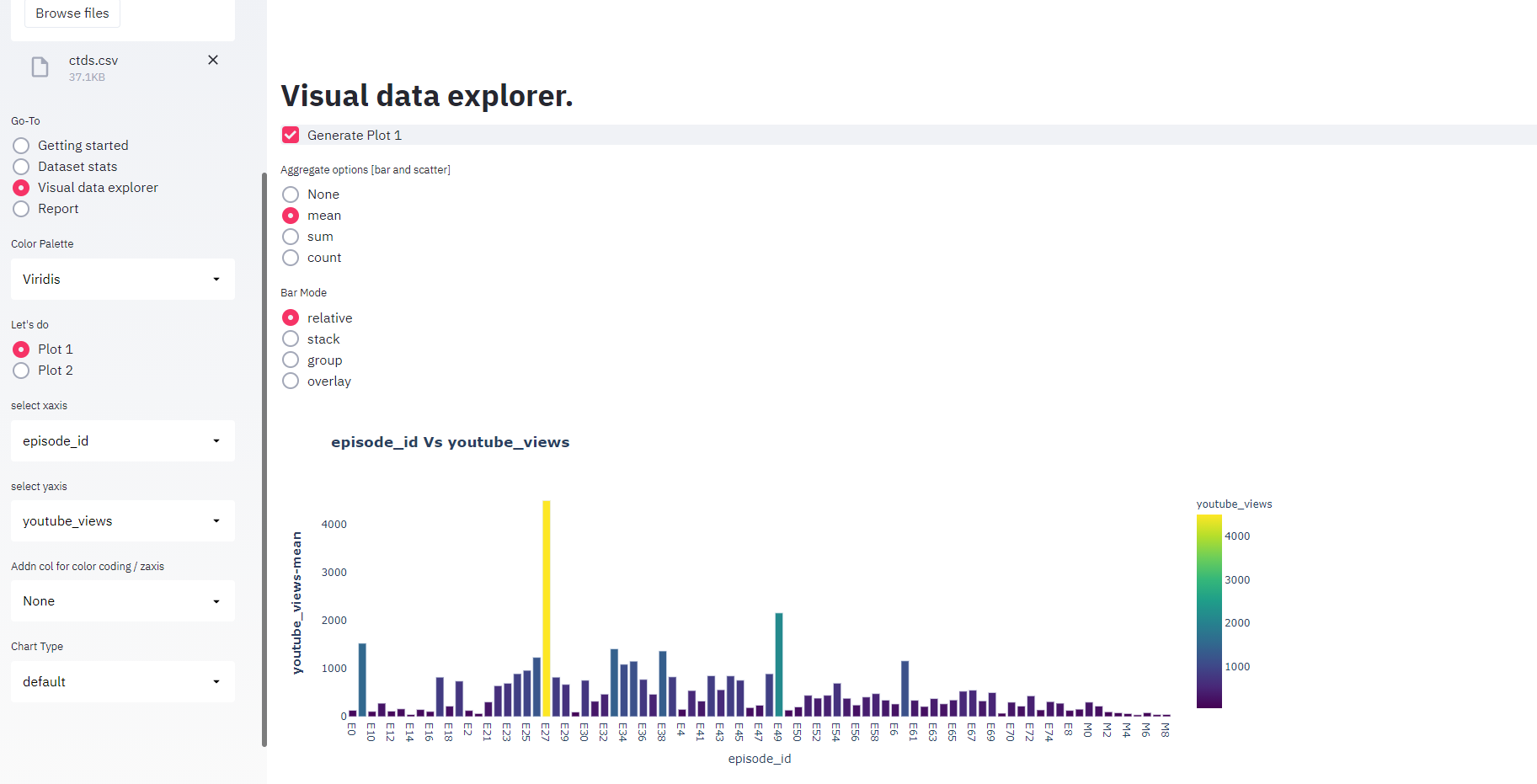
- If user wants to see 3rd axis view, user can select “Addn col for color coding/zaxis”. Against x vs yaxis, color code will be applied based on 3rd column selection
- Feel free to explore graph types like heatmap, box plots, histograms, which gives different perspectives about the data but less explored chart types
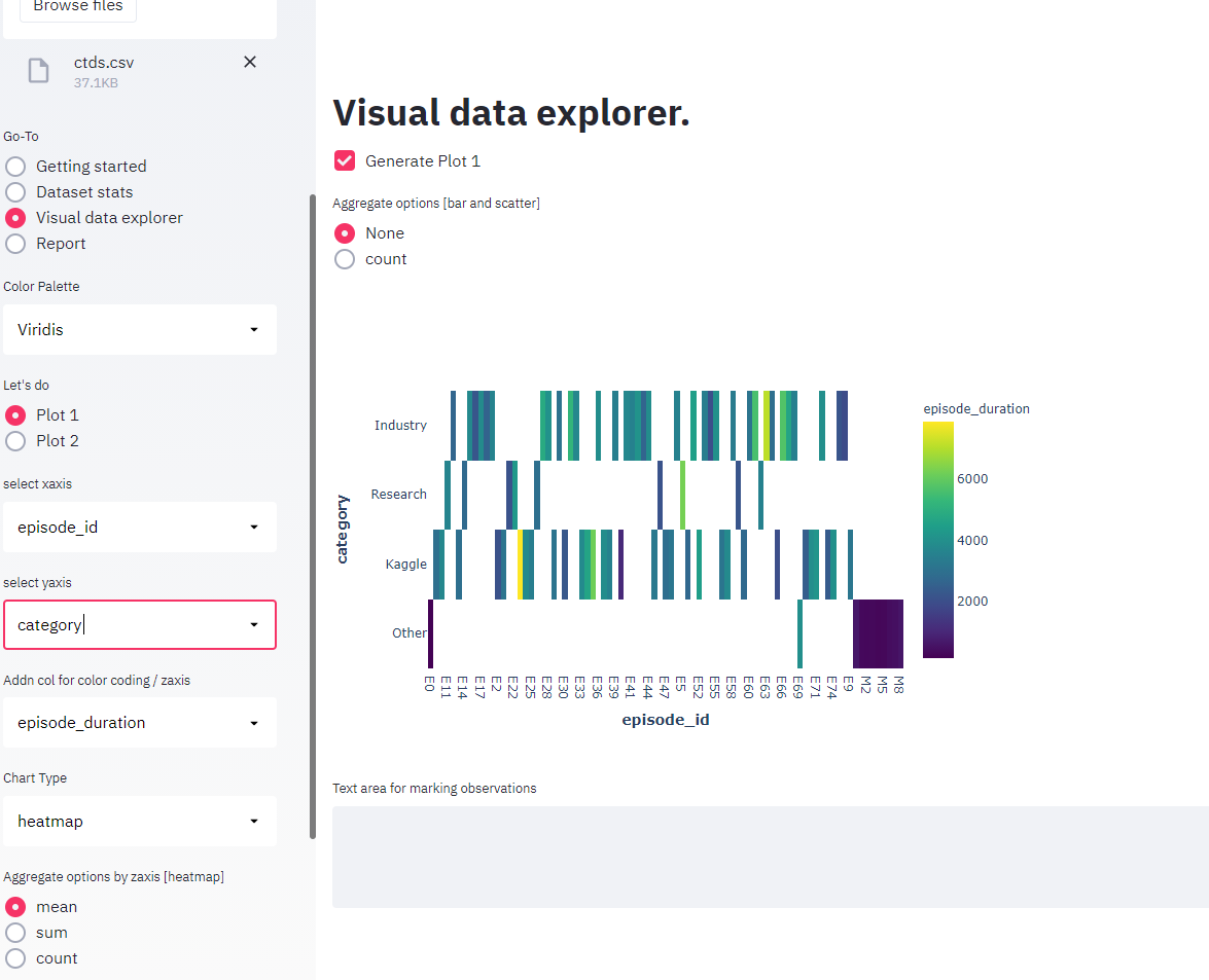
Heatmap 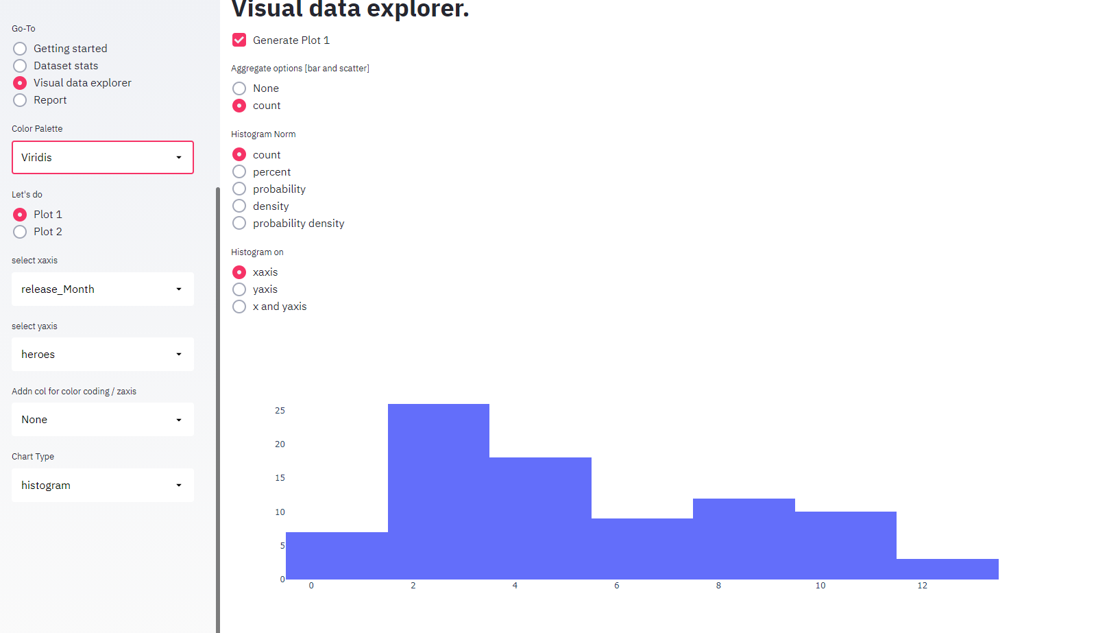
Histogram 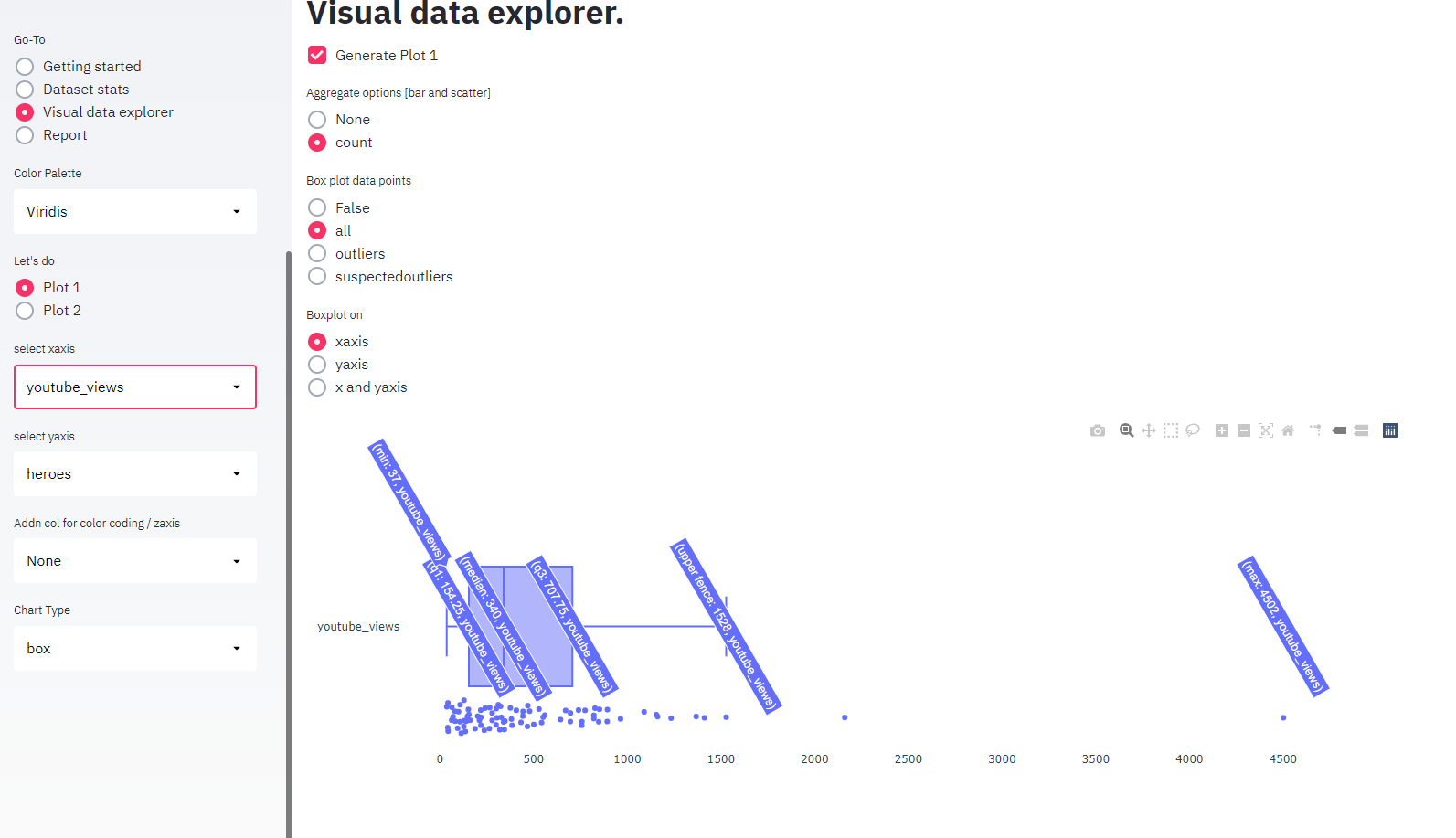
Box - select xaxis, yaxis and click “Generate Plot 1 in right pane” to get default graph. Based on chosen columns, default graph type and options will be generated. User can change graph type and options based on the need.
License
- vizdxp is completely free, open sourced and licensed under MIT license.
- Vizdxp is developed with Streamlit as the framework. Further details on streamlit
- Plotly is the visualization library used. Further details on plotly